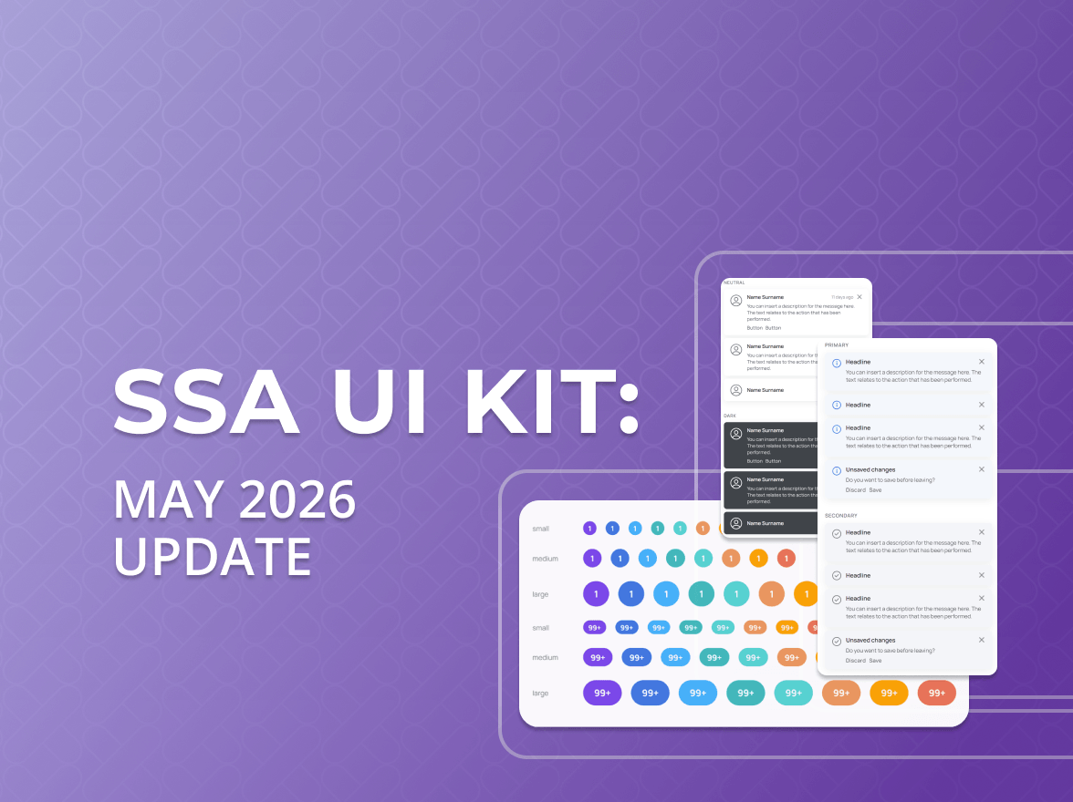
The SSA team has been hard at work, and we are excited to roll out a fresh batch of components in SSA UI kit. Below is a quick tour of what’s new.
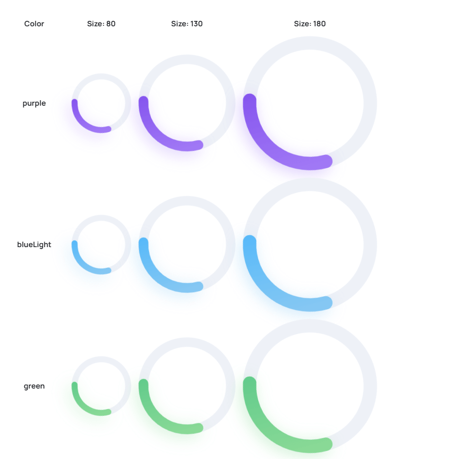
🌀 Progress Circle
This is a simple, round loading bar that animates continuously to show that something is still happening. It’s designed without any distracting numbers or percentage signs inside, offering a clean visual cue for ongoing activity like loading or processing. Think of it as a subtle way to indicate that the system is busy and working in the background.
Characteristics:
Simply spins while loading
Adjustable ring size and thickness to suit any layout
Automatically picks up your theme colours
Accessible for screen readers and fine for right-to-left layouts
Resizes itself smoothly whenever its container changes
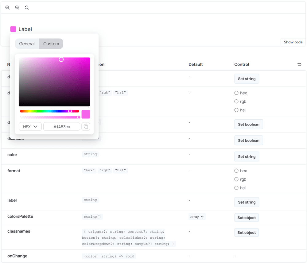
🎨 Colour Picker
This versatile tool lets you pick colours quickly and intuitively, perfect for setting basic tones. But when you need ultimate control, you can also fine-tune every colour channel with precision. Whether you are a designer aiming for specific shades or a developer needing exact hex codes, our colour picker streamlines the process, ensuring you get the perfect colour for any element in your UI.
Characteristics:
Quick picker – one-click swatch list for instant selections
Full picker – tap to open the palette, then drag sliders or type a colour in HEX, RGB or HSL
Copy button beside every format
Balanced for speed and precision – instant presets plus fine-tuned control
Keyboard and screen reader friendly
📈 Candle Stick Chart
Introducing the Candle Stick Chart, a purpose-built component for visualizing financial and time-series data with clarity and impact. Designed to highlight patterns and trends over time, it brings a clean, professional aesthetic to your dashboards while ensuring key metrics remain easy to interpret.
Whether you are tracking stock movements, pricing changes, or any time-based dataset, Candle Stick Chart makes complex data both insightful and visually compelling.
Characteristics:
Flexible Timeframe Selection: Choose custom candle periods and easily switch between built-in intervals like 1D, 1W, 1M, etc.
Auto‑scaling axes & responsive redraw on container resize
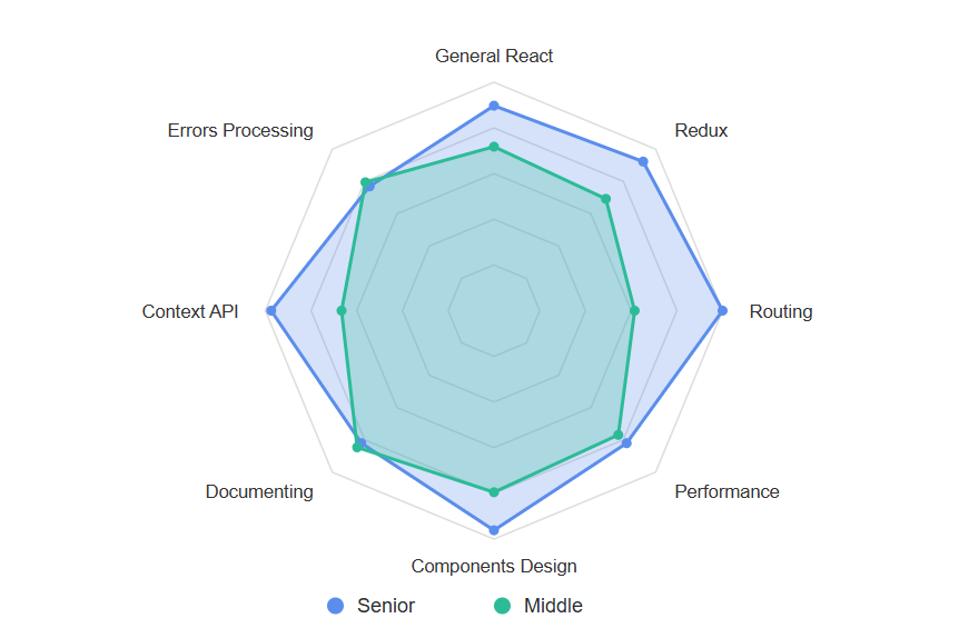
🕸️ Radar Chart
Radar Chart component, a powerful tool for visualizing complex, multi-variable data. As demonstrated in the example, it brings a new level of clarity and insight to your comparative analyses, whether you are evaluating product characteristics, performance metrics, or diverse datasets.
Characteristics:
Add or remove axes while the chart is already on screen; no restart needed
Smooth animation on structure changes
Redesigned pop-ups so it’s easier to see each number
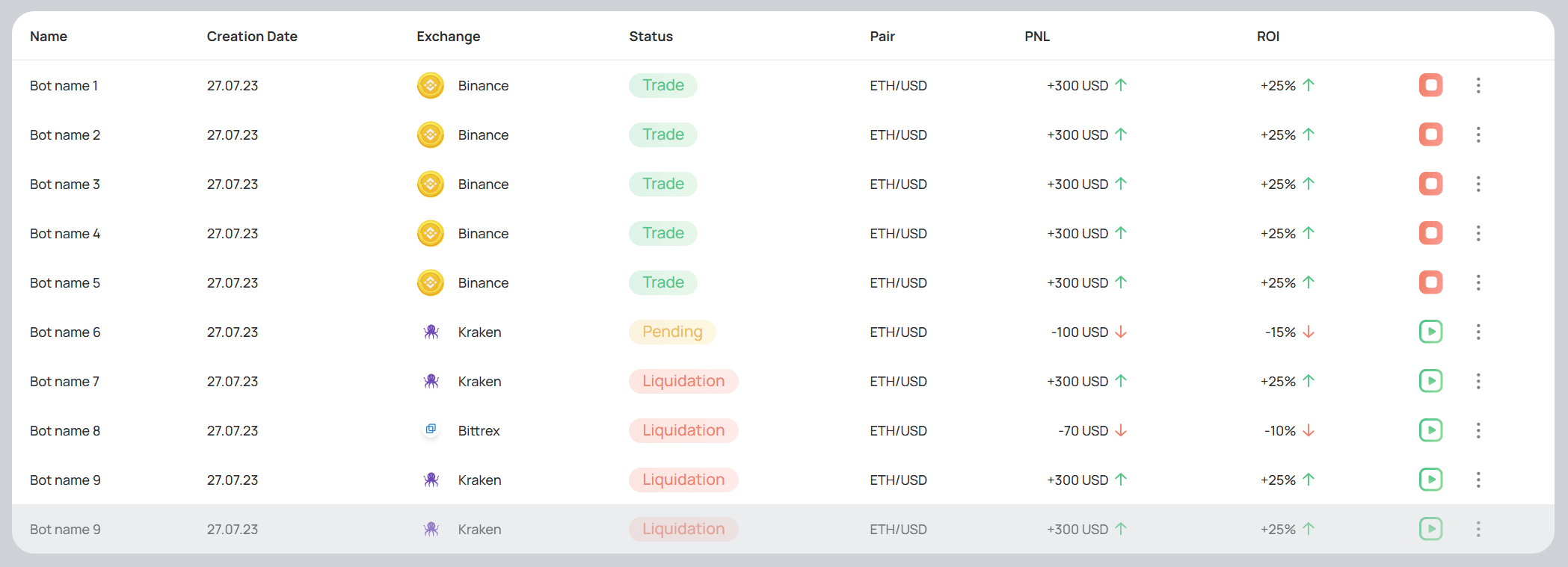
🗃️ Table Polishing
We’re excited to introduce the newly polished component designed to make your tabular data not just functional, but also visually appealing and incredibly easy to interpret. This isn’t just about good looks; it’s about delivering superior user experience when interacting with complex datasets.
A consistent experience from simple lists to deeply nested structures:
Unified spacing, typography & hover states across linear and hierarchical tables
Updated zebra striping logic for readability in dense data sets
New cell-level status tokens (success, warning, danger) for quick scanning
What’s Next
Even more exciting components are on the way! Subscribe to our blog for the latest updates, and we’d love to hear your thoughts in the comments below!
Ready to build a custom dashboard using SSA UI kit? Leave a comment below or fill out the contact form to get started!
share the article
00votes
Article Rating
Subscribe
To comment, please log in with your Facebook or LinkedIn social account
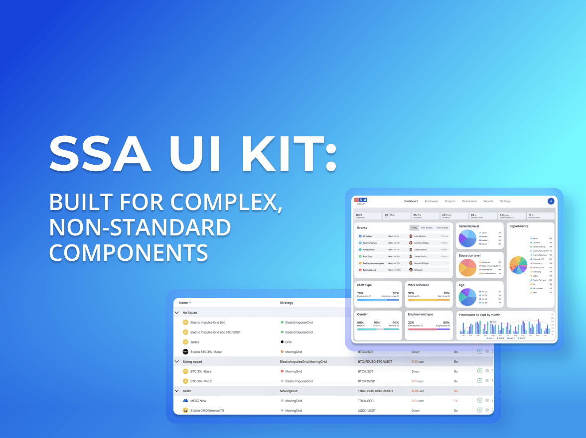
When people hear “UI kit”, they usually think of buttons, inputs, modals. A standard set of building blocks that exists in almost every design system and is often used to create a React JS dashboard or other typical interfaces.
We use cookies to ensure that we provide you the best experience on our website. If you continue to use this site we assume that you accept that. Please see our Privacy policyConfirm