SSA UI kit: built for complex, non-standard components
When people hear “UI kit”, they usually think of buttons, inputs, modals. A standard set of building blocks that exists in almost every design system and is often used to create a React JS dashboard or other typical interfaces.
SSA UI kit is built differently.
We are not trying to become another library of standard components. Our focus is on more complex, non-standard components designed for real product scenarios. Yes, we do have standard components. But they are not the core of the system. They are the foundation.
What do we mean by “non-standard”?
Non-standard does not mean visually unusual for the sake of it.
It means components that:
solve real product problems, not abstract UI cases
combine multiple layers of logic and interaction
depend on context such as data, roles, and workflows
cannot be reduced to simple building blocks
Examples include components and patterns used in real products:
activity history and event tracking interfaces
advanced configuration controls
dense toolbars and workspace interactions
components designed around real product workflows
These are not things you can easily take from a typical UI library or a dashboard UI React template-based approach. Teams usually rebuild them from scratch. We decided to systematize this layer.
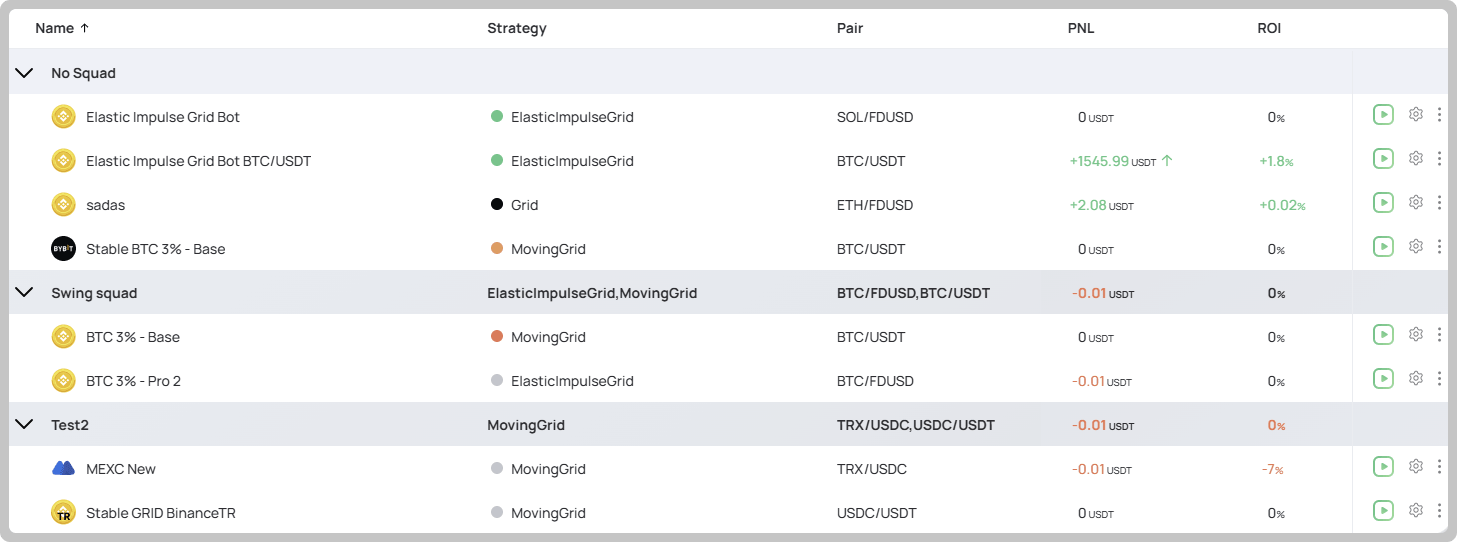
NestedTable component designed for complex, data-heavy workflows
Why focus on this?
Because this is where most complexity lives.
Standard UI components are already well established. The real challenges start when:
interfaces deal with real data
workflows become more advanced
industry-specific requirements appear
This is where teams:
reinvent solutions
lose consistency
struggle to align design and development
SSA UI kit helps close that gap by capturing not just UI patterns, but product patterns — going far beyond what you would expect from a typical react data dashboard setup.
Who is this for?
SSA UI kit is built for teams working on complex products.
It is especially relevant for:
HR Tech
MarTech
FinTech
These domains require:
data-heavy interfaces
role-based experiences
complex user flows
high-density UI
In these environments, standard components are not enough. Teams need components that reflect real workflows and product logic.
We also build and apply components in other domains, such as fitness, where similar interface challenges appear.
Built on real product experience
SSA UI kit is not a theoretical system.
All components are:
used in our internal products
tested in real scenarios
evolving together with product needs
We build our own products in HRTech, MarTech, and FinTech, and this directly shapes the library. Many of the components are also designed to support AI-driven workflows, where interfaces need to handle dynamic data, recommendations, and adaptive interactions.
As a result:
components reflect real use cases
they are closer to production than to demos
they are designed as parts of working systems
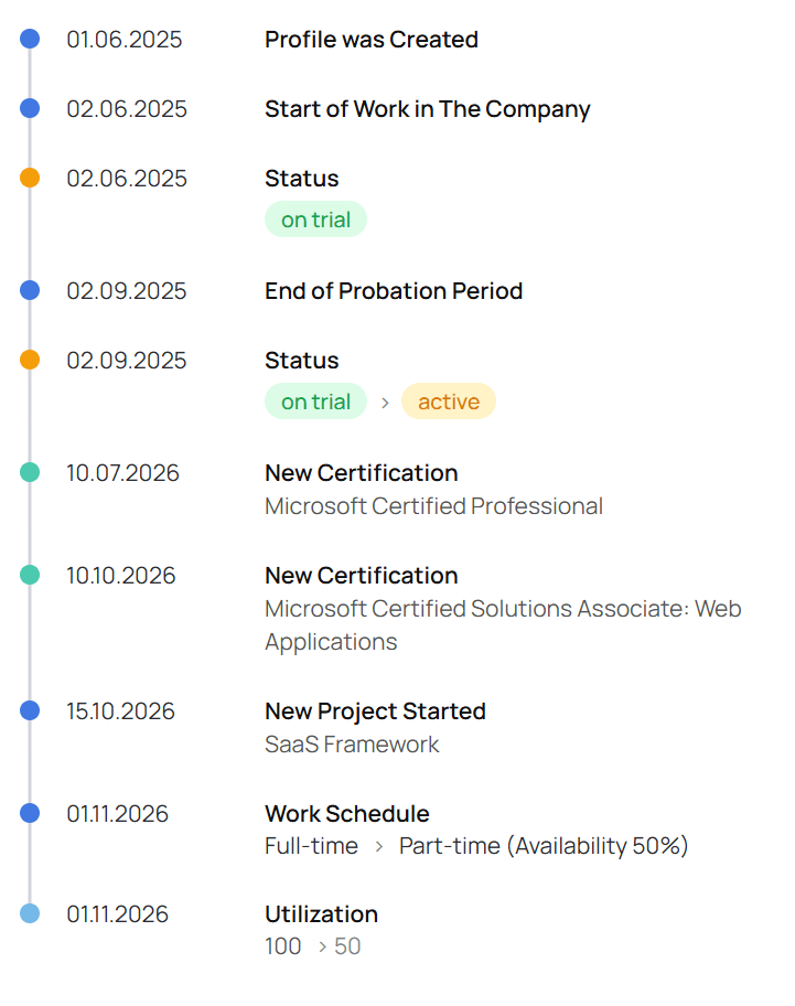
History component used for activity tracking and workflow visibility across real products
What if you need something even more non-standard?
That is expected.
No library can cover every possible scenario, especially in complex products. SSA UI kit is a growing system:
we expand it as new needs appear
we adapt components to new use cases
we are open to extending it further
If you have a case that goes beyond what is currently available, reach out to us. We will help you design and build the right solution and extend the library together.
The balance: standard and complex
We are not ignoring standard components.
They exist and they matter.
But they are not the main value. The strength of SSA UI kit is in covering the layer between simple UI elements and full product solutions — whether you are building from scratch or extending a template dashboard React approach.
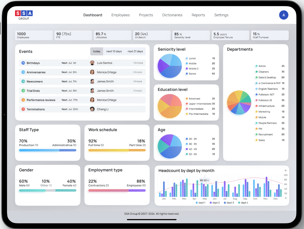
Real product interfaces built with SSA UI kit
Summary
SSA UI kit is more than a component library.
It is a system of product-oriented components focused on:
complex scenarios
industry-specific needs
real-world usage
That is what makes SSA UI kit different.
If you are building complex products and feel limited by standard component libraries, SSA UI kit might be exactly what you need.
Get in touch with us to learn more or explore how SSA UI kit can solve your specific product challenges. If you are a developer and like what we are building, join our community and shape SSA UI kit with us.
share the article
00votes
Article Rating
Subscribe
To comment, please log in with your Facebook or LinkedIn social account
Modern HR systems manage much more than employee records.
They bring together skills, experience, roles, projects, certifications, performance data, and other information that changes throughout the employee lifecycle.
SSA UI kit continues to evolve with a focus on solving real product challenges—not only by expanding the component library, but also by improving developer experience.
We use cookies to ensure that we provide you the best experience on our website. If you continue to use this site we assume that you accept that. Please see our Privacy policyConfirm