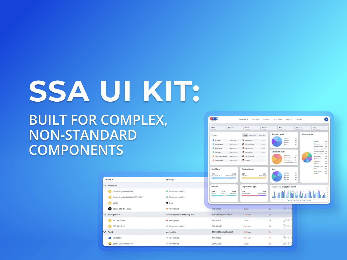
SSA UI kit continues to evolve with a focus on solving real product challenges—not only by expanding the component library, but also by improving developer experience.
This month’s update introduces two new reusable components, Avatar and File Upload, along with a new way for developers to interact with the library through AI assistants using an MCP (Model Context Protocol) server.
New Components
Avatar
Although Avatar is one of the simplest UI elements, it appears throughout almost every business application—from profile pages and navigation menus to comments, activity feeds, data tables, and chat interfaces.
Implementing avatars differently across projects often leads to inconsistent styling and duplicated code. SSA UI kit provides a reusable Avatar component that keeps user representation consistent while remaining flexible enough for different product designs.
The Avatar component is designed for teams building React JS dashboards, admin panels, and other business applications that require consistent user representation across the interface.
Features
Profile image support
Initials fallback
Configurable sizes
Flexible styling
Theme support
Consistent placeholder behavior
Typical use cases
User profiles
Team directories
Comments
Activity feeds
Data tables
Chat applications
File Upload
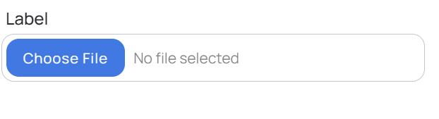
Uploading files is part of countless business workflows—from attaching documents and importing datasets to sharing reports and managing project assets.
File Upload is a new addition to SSA UI kit and is already in active use across several of our internal products.
The component fits naturally into CRM systems, internal tools, customer portals, and other applications built with a React-based UI framework.
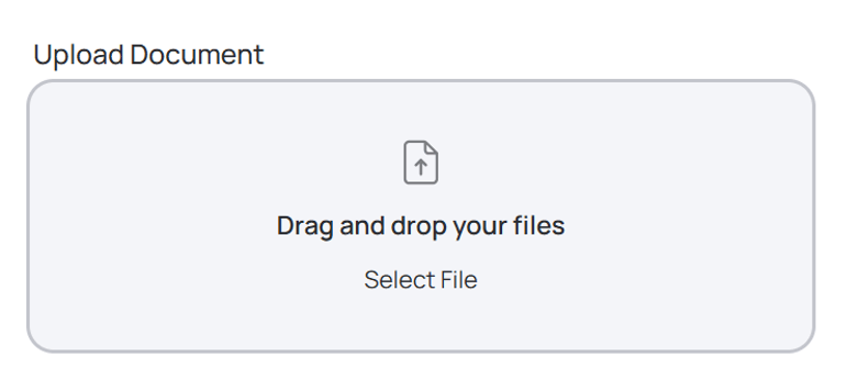
It supports the two interaction patterns users expect most:
Click to upload
Drag & Drop
Features
Click-to-upload and drag-and-drop support
Multiple file upload
File validation
Upload progress handling
Flexible customization
Easy backend integration
Typical use cases
CRM systems
HR platforms
Document management systems
Customer portals
Internal business tools
Admin dashboards
AI-Powered Documentation with MCP
This month we also focused on improving the developer experience.
Together with the growing component library, this makes SSA UI kit a more powerful React admin UI kit, helping developers discover and implement components without interrupting their workflow.
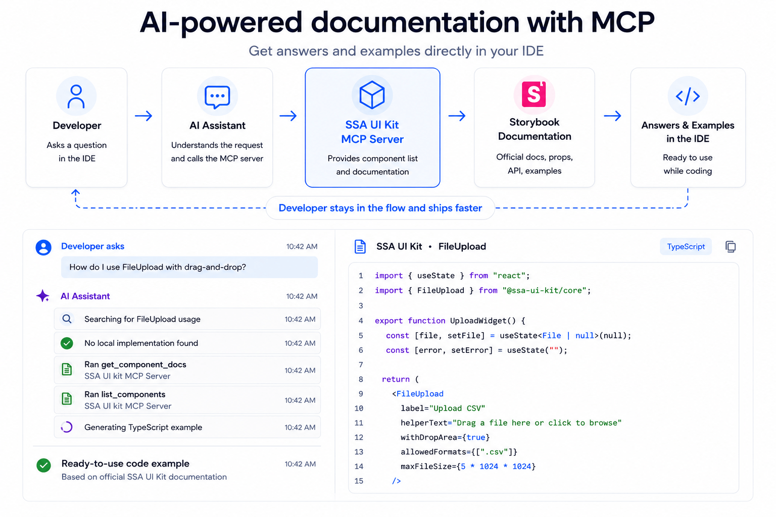
Our Storybook documentation is now available through an MCP (Model Context Protocol) server, allowing AI coding assistants to access the official SSA UI kit documentation directly from the development environment.
Instead of switching between the IDE and Storybook, developers can ask questions in natural language while building their application.
For example:
Which SSA UI kit component should I use for user profile images?
or
How do I use the File Upload component with drag-and-drop support?
When a developer asks a question, the AI assistant first analyzes the current project. If the required information isn’t available in the project, it calls the SSA UI kit MCP server to retrieve the relevant component documentation.
The assistant can then generate accurate answers and implementation examples based on the official documentation—without the developer leaving the IDE.
(Illustration: AI-powered documentation workflow + MCP in action)
As a result, developers can stay focused on implementation while working with documentation and examples that always reflect the current version of SSA UI kit.
Current capabilities
The current SSA UI kit MCP server exposes two methods:
get_components — returns the list of available components
get_component_docs — returns documentation for the selected component
These methods allow AI assistants to:
answer questions about SSA UI kit components;
recommend suitable components for specific UI scenarios;
provide implementation examples based on the official documentation;
explain component APIs and configuration
Because responses are generated from the official documentation, developers receive answers that stay aligned with the current version of the library.
Getting Started with MCP
If you’re already using SSA UI kit, you can connect the MCP server to your preferred AI coding assistant and start accessing component documentation directly from your development environment.
July’s update expands SSA UI kit in two important directions.
On one hand, Avatar and File Upload provide reusable building blocks for interfaces that appear in almost every business application.
On the other hand, MCP integration makes the library easier to explore and use with modern AI-assisted development workflows.
As SSA UI kit continues to grow, our goal remains the same: building reusable components—and the developer tools around them—that help teams create React dashboards and business applications faster, with consistent user experience and less repetitive frontend work.
The MCP server is available for teams using SSA UI kit in their projects and can be configured to work with supported AI coding assistants.
Explore SSA UI kit
Whether you’re building a new React application or extending an existing platform, SSA UI kit helps teams deliver consistent interfaces faster with reusable, production-tested components.
If you’re already using SSA UI kit, explore the new Avatar and File Upload components and try the MCP integration with your preferred AI coding assistant.
If you’re looking to accelerate frontend development for dashboards, admin panels, or other business applications, contact our team to learn how SSA UI kit can become part of your development workflow.
share the article
00votes
Article Rating
Subscribe
To comment, please log in with your Facebook or LinkedIn social account
Modern HR systems manage much more than employee records.
They bring together skills, experience, roles, projects, certifications, performance data, and other information that changes throughout the employee lifecycle.
When people hear “UI kit”, they usually think of buttons, inputs, modals. A standard set of building blocks that exists in almost every design system and is often used to create a React JS dashboard or other typical interfaces.
We use cookies to ensure that we provide you the best experience on our website. If you continue to use this site we assume that you accept that. Please see our Privacy policyConfirm