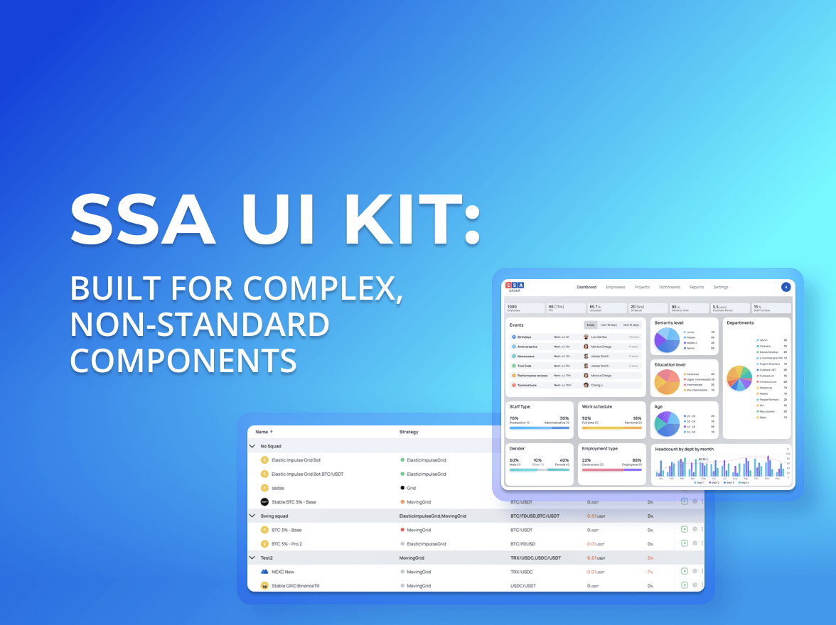
We continue expanding the SSA UI kit with new components designed for dashboards, admin panels, and workflow-driven interfaces built with React.
This update introduces new components focused on system messaging and activity feedback: Counter, Alert, Notification, and Toast.
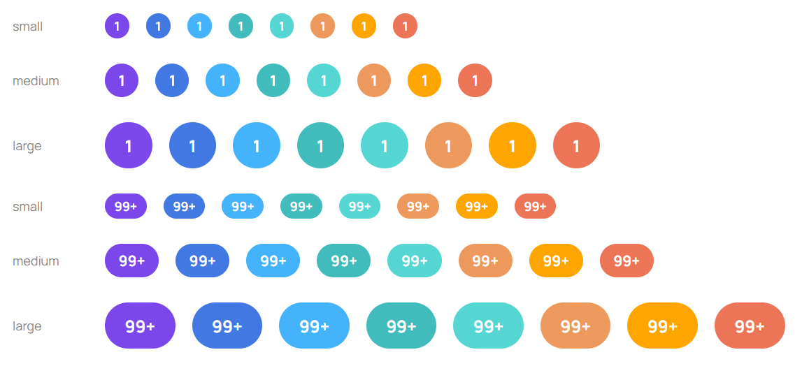
Counter
Counter is a compact numeric indicator component used for displaying counts, badges, and activity totals across application interfaces.
The component supports multiple sizes, semantic variants, and custom color overrides, making it suitable for analytics platforms, internal tools, and ReactJS admin dashboard interfaces.
Features
Three sizes: small, medium, large
Semantic variants with theme palette integration
Optional custom color support
Overflow handling with automatic 99+ clamping
Dot mode when count is omitted
CSS override support for positioning and styling adjustments
Common use cases
Notification badges
Pending task indicators
Dashboard item counters
Presence indicators
Activity summaries
Counter helps visualize activity, pending actions, and item totals across data-driven applications.
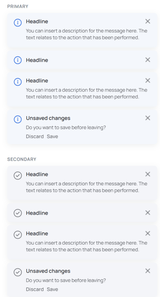
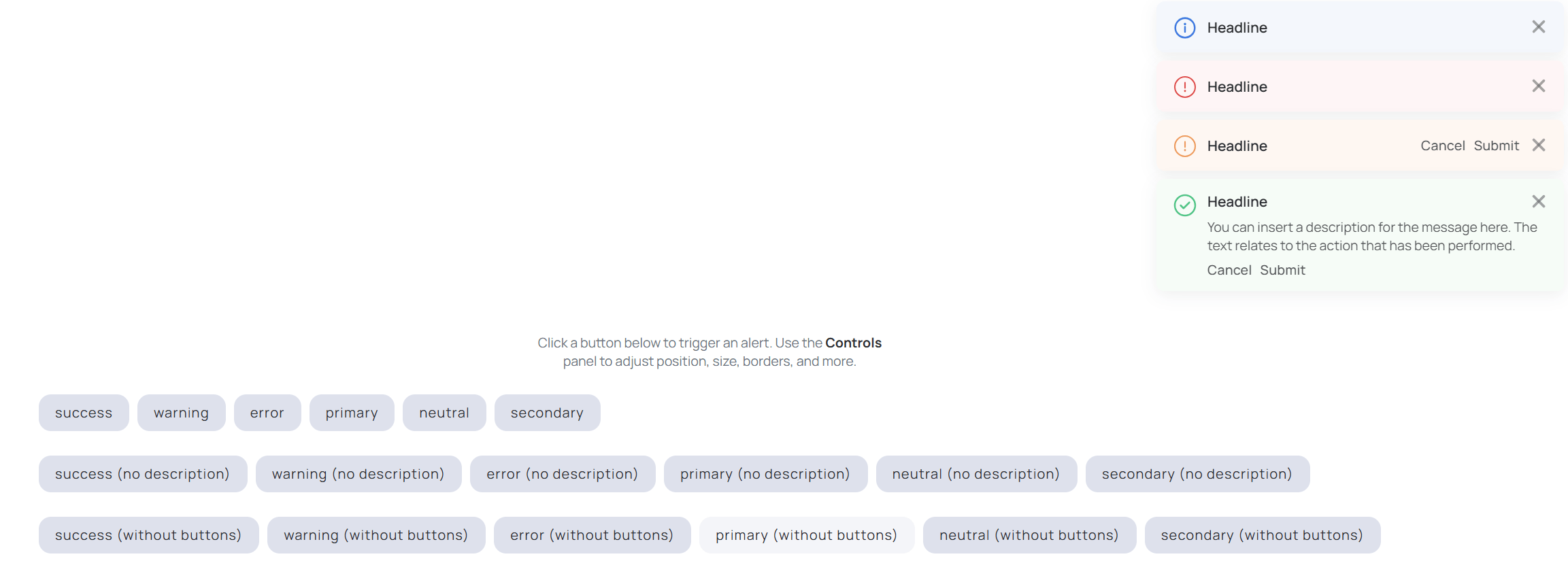
Alert
Alert is an inline messaging component for displaying validation feedback, warnings, informational messages, and system states directly inside the interface.
The component supports multiple semantic variants, optional dismiss controls, and inline actions.
Features
Optional dismiss action
Support for action buttons and commands
Flexible layouts with or without descriptions
Custom color and CSS styling support
Semantic variants:
Primary
Success
Warning
Error
Neutral
Common use cases
Validation feedback
Warning and error states
Contextual guidance
Inline workflow messaging
System status communication
Alert helps communicate important system states and validation feedback across workflow-oriented applications.
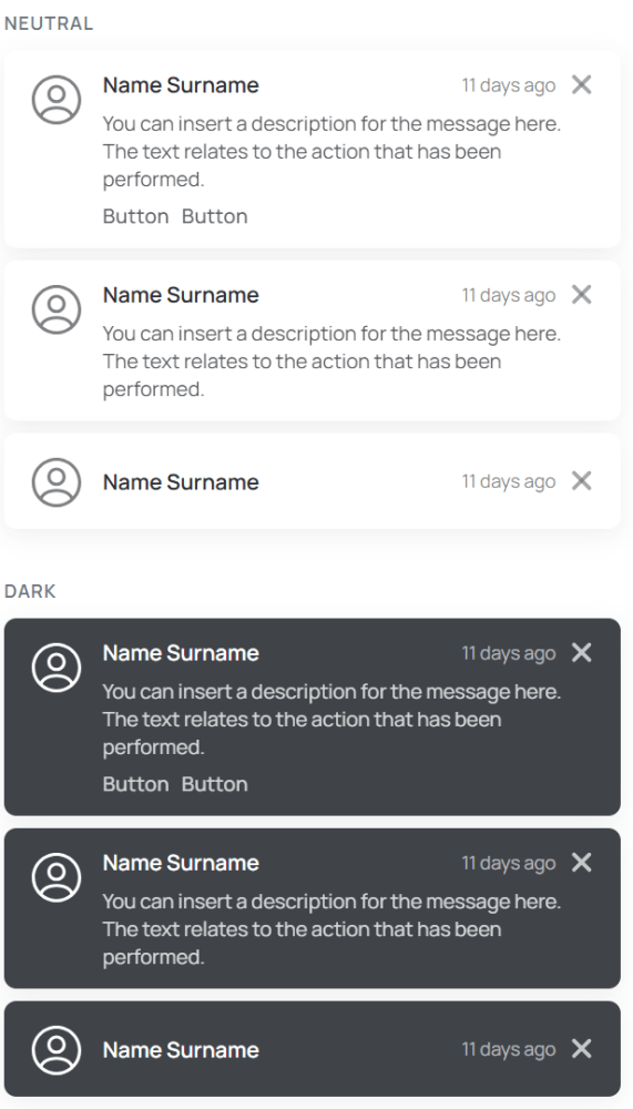
Notification
Notification is designed for longer-lived in-app messaging related to workflows, background operations, and application activity.
Compared to inline alerts, notifications provide more persistent feedback and support richer interaction patterns.
Features
Configurable auto-dismiss behavior
Support for additional actions
Stack management and simultaneous display limits
Optional animations and transitions
Flexible sizing and positioning
Light and dark theme support
Common use cases
Workflow updates
Background process status
Activity tracking
System-level messaging
Multi-step operation feedback
Notification is particularly useful for workflow monitoring and activity tracking inside a React reporting dashboard or other data-driven applications.
Toast
Toast provides compact temporary feedback for short-lived system messages and action confirmations.
The component includes built-in dismiss behavior and configurable auto-dismiss timing.
Features
Built-in dismiss support
Configurable auto-dismiss timeout
Progress bar for remaining visibility time
Configurable maximum visible toast count
Persistent mode support
Semantic variants and custom styling options
Common use cases
Success confirmations
Temporary system feedback
Save and submit notifications
Lightweight workflow updates
Action result messaging
Toast is useful for lightweight action feedback and temporary status updates inside dashboards, admin panels, and workflow-oriented applications.
Building with SSA UI kit
SSA UI kit continues to evolve alongside our internal products and client applications, helping teams build consistent, scalable, and workflow-oriented interfaces faster.
Need a dashboard, admin platform, or internal tool? Our team can design and develop a custom React JS dashboard based on SSA UI kit, helping accelerate delivery, reduce frontend development overhead, and maintain scalable frontend architecture.
We also continue growing the SSA UI kit community and welcome frontend developers interested in contributing to the library and sharing engineering best practices around modern React applications.
Write to us — we’re always open to new projects, collaboration opportunities, and feedback.
share the article
51vote
Article Rating
Subscribe
To comment, please log in with your Facebook or LinkedIn social account
When people hear “UI kit”, they usually think of buttons, inputs, modals. A standard set of building blocks that exists in almost every design system and is often used to create a React JS dashboard or other typical interfaces.
SSA UI kit continues to evolve alongside our products, adapting to the growing complexity of real-world, data-driven interfaces and modern React JS dashboards.
We use cookies to ensure that we provide you the best experience on our website. If you continue to use this site we assume that you accept that. Please see our Privacy policyConfirm