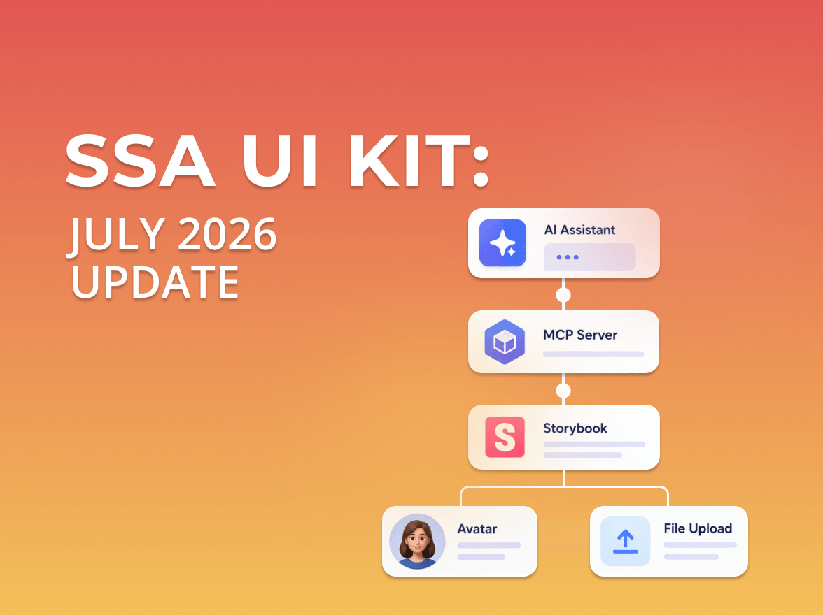
SSA UI Kit: July Update
SSA UI kit continues to evolve with a focus on solving real product challenges—not only by expanding the component library, but also by improving developer experience.
SSA UI kit continues to evolve alongside our products, adapting to the growing complexity of real-world, data-driven interfaces and modern React JS dashboards.
Over the past months, we focused on balancing consistency across projects, actively using the component library in our own products to ensure a unified experience while keeping it flexible for customization. Alongside that, we’ve introduced new components to support more real-world scenarios.
Here’s what has changed.
One of the biggest updates is the introduction of a unified color system at the library level.
Below is an example of how the Component Variants Palette is applied across different component states and sizes:
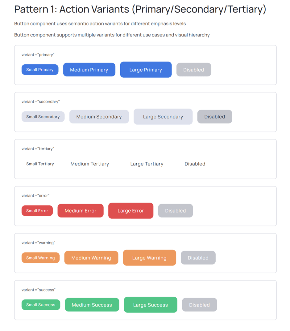
We’ve implemented a Component Variants Palette, which standardizes how colors are defined and used across all components.
The palette now includes:
This allows teams to work with consistent visual language without manually managing color values, while SSA UI kit supports scalable admin interfaces and React dashboard UI applications.
The palette is fully integrated into core components where it matters most:
It continues to expand across other components where relevant.
This makes it possible to apply semantic and brand colors directly, reducing the need for custom styling and ensuring consistency across the interface.
We’ve also introduced documentation that explains how to:
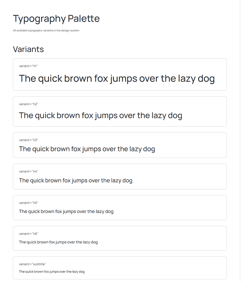
Typography now follows the same structured approach as colors — controlled, scalable, and consistent across projects.
This ensures consistent typography across products while allowing controlled customization through predefined variants.
We extend the library with a flexible set of React admin UI kit components for building modern dashboards and data-driven interfaces:
A new Slider component has been added to handle value ranges across different scenarios.
It supports:
The examples below show how the slider adapts to different use cases, from simple ranges to inputs with manual value control.
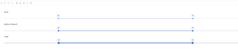
The component is designed to work both as a lightweight control and as part of more complex data input flows.
The Icon Button is a compact icon-only button designed for space-constrained interfaces. It allows users to perform actions quickly without adding visual clutter, making it ideal for toolbars and dense dashboards.
The configuration options allow flexible control over behavior and styling, making the component adaptable to different UI scenarios.
It integrates directly with the icon library, allowing any icon to be used without additional setup.
The examples show different configuration states, including default, disabled, and tooltip-enabled variants.
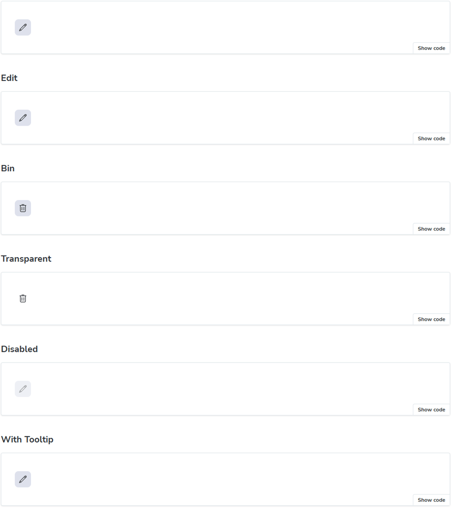
Typical use cases include:
The History component is designed to visualize timelines within a project.
It accepts structured data such as:
and renders a clear timeline view.
The example below illustrates how timeline data is visually structured and presented within the component.
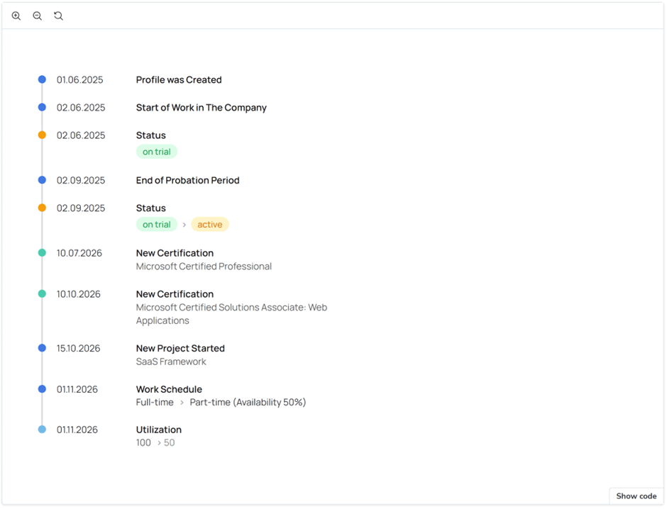
It is particularly useful for:
SSA UI kit components are actively used in our own products to solve real interface challenges.
For example:
These components are designed not as isolated UI elements, but as building blocks for real product scenarios.
In addition to new components, we continue improving existing ones — refining behavior, enhancing consistency, and adapting them to real product needs.
SSA UI kit is not static. It evolves together with the products it supports.
Learn more about the library and explore how to build dashboards with React using reusable UI components in modern React applications.
We’re actively working on expanding the component set and improving the system further.
More components and deeper customization capabilities are already in progress.
Stay tuned.
Need a dashboard for your product or want to contribute to the library?
Write to us — we’re open to cooperation and feedback.
SSA UI kit continues to evolve with a focus on solving real product challenges—not only by expanding the component library, but also by improving developer experience.
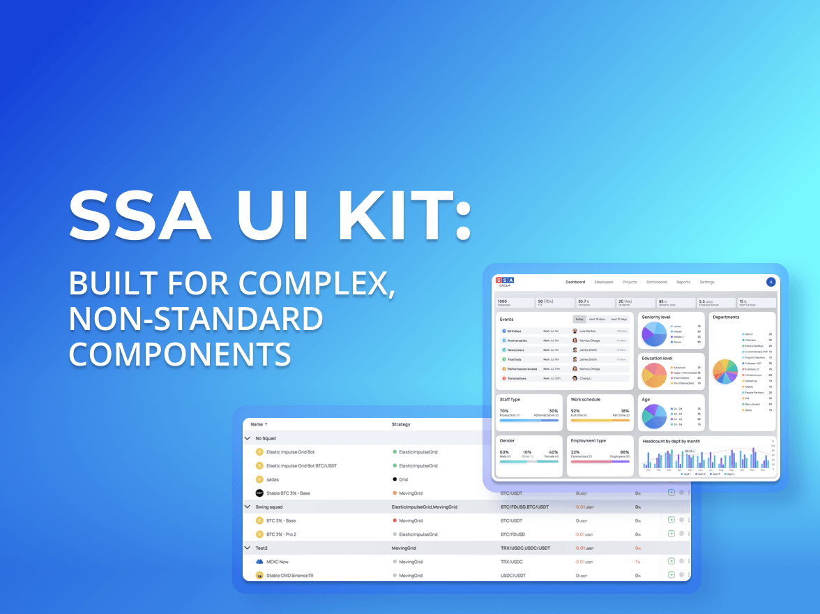
When people hear “UI kit”, they usually think of buttons, inputs, modals. A standard set of building blocks that exists in almost every design system and is often used to create a React JS dashboard or other typical interfaces.
you're currently offline