Expanding SSA UI kit for faster, smarter dashboards
Designing dashboarding solutions should feel rewarding and not time-consuming. That’s why SSA UI kit keeps evolving: to hand you ready-made building blocks that turn raw numbers into clear, compelling stories. Today we are rolling out two new components and previewing three more that are well underway.
Bar Gauge Chart
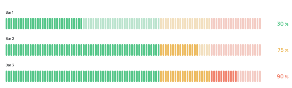
A hybrid that pairs the compact “at-a-glance” clarity of a gauge with the familiarity of a bar. Perfect for progress toward targets, utilization percentages, or any metric where “how full” tells the tale.
Key features
Dynamic, animated value changes for real-time dashboards
Custom threshold markers (warning / critical)
Automatic color ramps by value bands
Fully responsive from 240 px up to widescreen dashboards
Big Number Chart
When a single metric needs the limelight, the Big Number Chart puts it front and centre, with optional contextual footnotes to round out the story.
Key features
Smart formatting (12.3 k, €1.4 M, 98 %)
Real-time, animated value updates for dynamic dashboards
Coming soon
We are polishing the next wave of visualizations, so expect them in the next releases:
Candlestick Chart: Classic OHLC (open-high-low-close) plot for financial or high-frequency price data.
Radar Chart: Multi-axis comparisons at a glance which is great for skill matrices or security posture assessments.
Color Picker: A streamlined theming utility that makes fine-tuning palettes effortless.
Watch & build in minutes
See SSA UI kit in action with our step-by-step video guide and create a simple dashboard in the time it takes to drink a cup of coffee:
Prefer a custom dashboard built by our experts? We can do it for you.Drop us a line and our expert team will deliver a turnkey solution, so you can focus on insights that matter.
share the article
4.52votes
Article Rating
Subscribe
To comment, please log in with your Facebook or LinkedIn social account
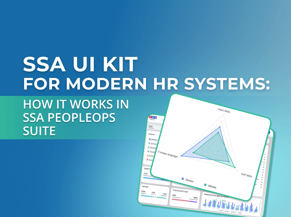
Modern HR systems manage much more than employee records.
They bring together skills, experience, roles, projects, certifications, performance data, and other information that changes throughout the employee lifecycle.
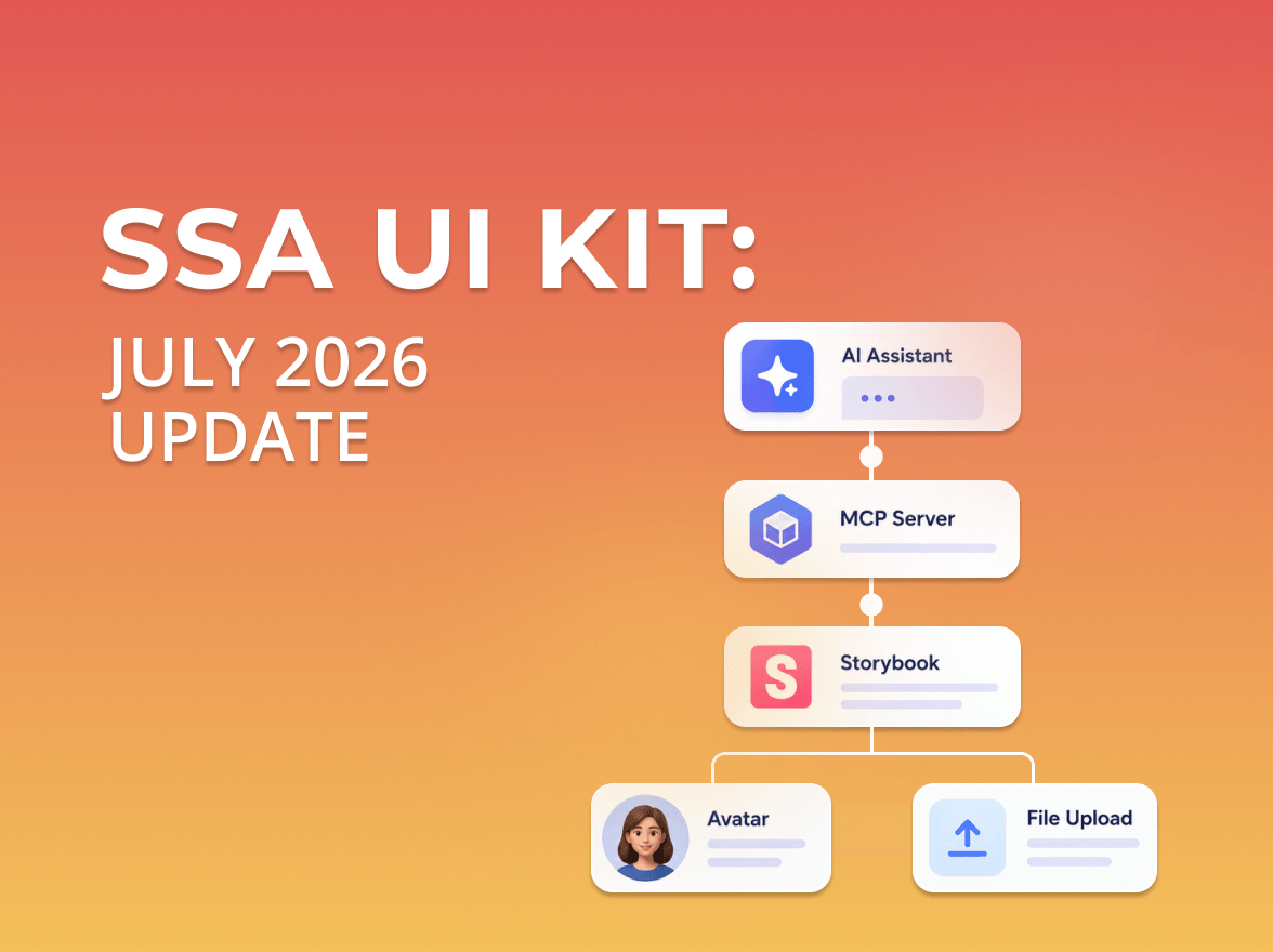
SSA UI kit continues to evolve with a focus on solving real product challenges—not only by expanding the component library, but also by improving developer experience.
We use cookies to ensure that we provide you the best experience on our website. If you continue to use this site we assume that you accept that. Please see our Privacy policyConfirm