SSA UI Kit: January 2026 Update
We continue to actively evolve SSA UI kit, our React-based component library for building complex dashboards and data-driven interfaces faster and more efficiently.
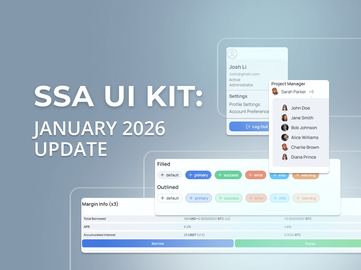
The SSA team has been hard at work, and we are excited to roll out a fresh batch of components in SSA UI kit. Below is a quick tour of what’s new.
This is a simple, round loading bar that animates continuously to show that something is still happening. It’s designed without any distracting numbers or percentage signs inside, offering a clean visual cue for ongoing activity like loading or processing. Think of it as a subtle way to indicate that the system is busy and working in the background.
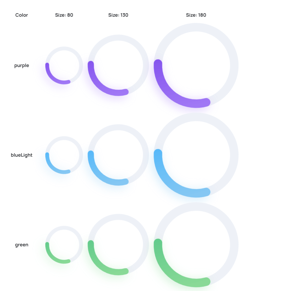
Characteristics:
This versatile tool lets you pick colours quickly and intuitively, perfect for setting basic tones. But when you need ultimate control, you can also fine-tune every colour channel with precision. Whether you are a designer aiming for specific shades or a developer needing exact hex codes, our colour picker streamlines the process, ensuring you get the perfect colour for any element in your UI.
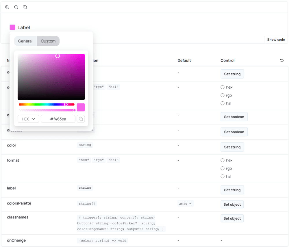
Characteristics:
Introducing the Candle Stick Chart, a purpose-built component for visualizing financial and time-series data with clarity and impact. Designed to highlight patterns and trends over time, it brings a clean, professional aesthetic to your dashboards while ensuring key metrics remain easy to interpret.
Whether you are tracking stock movements, pricing changes, or any time-based dataset, Candle Stick Chart makes complex data both insightful and visually compelling.

Characteristics:
Radar Chart component, a powerful tool for visualizing complex, multi-variable data. As demonstrated in the example, it brings a new level of clarity and insight to your comparative analyses, whether you are evaluating product characteristics, performance metrics, or diverse datasets.
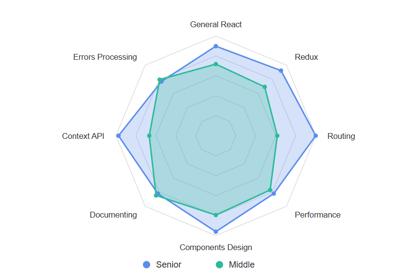
Characteristics:
We’re excited to introduce the newly polished component designed to make your tabular data not just functional, but also visually appealing and incredibly easy to interpret. This isn’t just about good looks; it’s about delivering superior user experience when interacting with complex datasets.
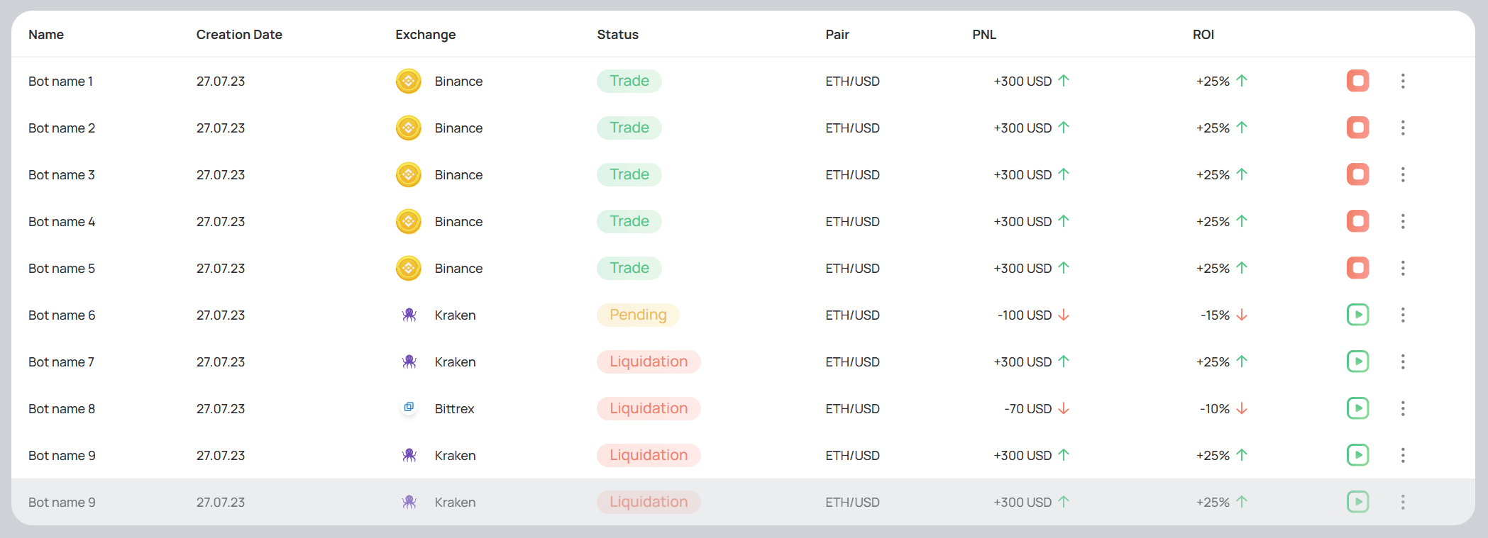
A consistent experience from simple lists to deeply nested structures:
Even more exciting components are on the way! Subscribe to our blog for the latest updates, and we’d love to hear your thoughts in the comments below!
Ready to build a custom dashboard using SSA UI kit? Leave a comment below or fill out the contact form to get started!
We continue to actively evolve SSA UI kit, our React-based component library for building complex dashboards and data-driven interfaces faster and more efficiently.
AI is changing how digital products are built. Instead of manually crafting every interface, we are entering a new era where intelligent systems like ChatGPT can generate dashboards, and admin panels automatically.
you're currently offline